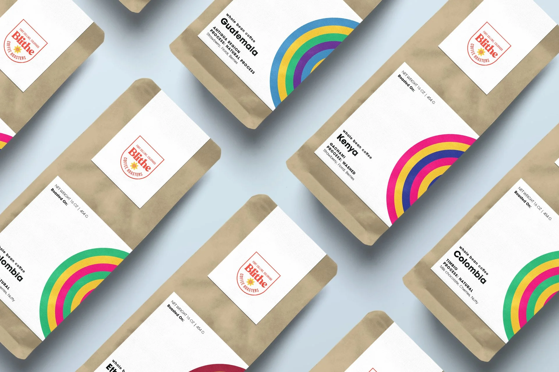
Blithe Coffee Roasters
Identity and packaging for a micro-roaster in Windsor, Colorado
Livin’ care free
The founder of Blithe was looking to develop a brand and packaging system as he prepared to turn his coffee-roasting hobby into a side-gig, and eventually a business. The name nods to living without care and the brand took on a happy-go-lucky persona. The flower power icon had roots in their family history and was an essential part of the identity.
The packaging concepts were required to be low-cost and easy to apply for a sole-proprietor bagging coffee in their garage.